BRAND DESIGN FOR "SWEET CREATIONS" BAKERY BUSINESS

Project Overview
Sweet Creations is a dessert and bakery brand that aims to provide delightful, visually appealing, and high-quality sweet treats. The brand's identity is playful, warm, and inviting, appealing to both casual dessert lovers and those celebrating special occasions.
Brand Personality & Values
-
Playful & Friendly: The brand embraces a fun and joyful personality, making desserts an exciting experience.
-
Creativity & Artistry: Sweet Creations emphasizes unique, beautifully crafted treats.
-
Warm & Approachable: The brand should feel welcoming to all ages, evoking nostalgia and happiness.
-
Quality & Freshness: The visual identity should communicate premium quality and freshly made products.
Design goals
-
Strengthen brand recognition with a cohesive and memorable look.
-
Maintain a balance between playfulness and premium quality.
-
Ensure versatility for different applications (print, digital, merchandise).
I began by researching their market, target audience, and competition.
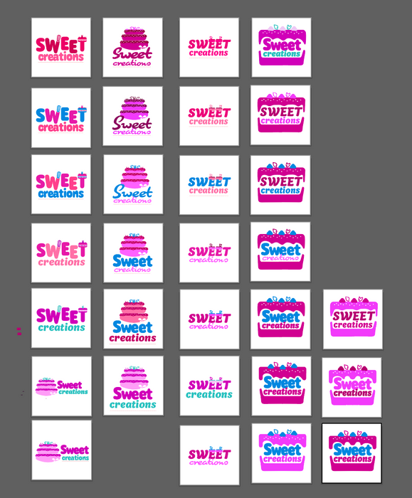
The logo design involves careful consideration of typography, color schemes, and symbolic elements to reflect the brand’s unique identity.
The bold, rounded typography emphasises warmth and approachability, while the pink colour palette reinforces the sweet, indulgent nature of the brand.
The cake logo mark adds a whimsical, illustrative touch, highlighting the bakery’s focus on desserts.
This design strikes a balance between fun and professional, creating a memorable visual identity that resonates with customers.
The lower "creations" text in a softer pink provides contrast while maintaining a cohesive color palette, ensuring legibility and balance. The curved, friendly font creates an inviting vibe, appealing to a broad audience.
The overall design is playful but polished, striking the right balance between a fun, approachable tone and a professional, memorable brand identity.
I navigated this design challenge by refining concepts and iterating on feedback, ensuring the final design is both visually compelling and versatile across platforms.


